Appearance
Page Editor
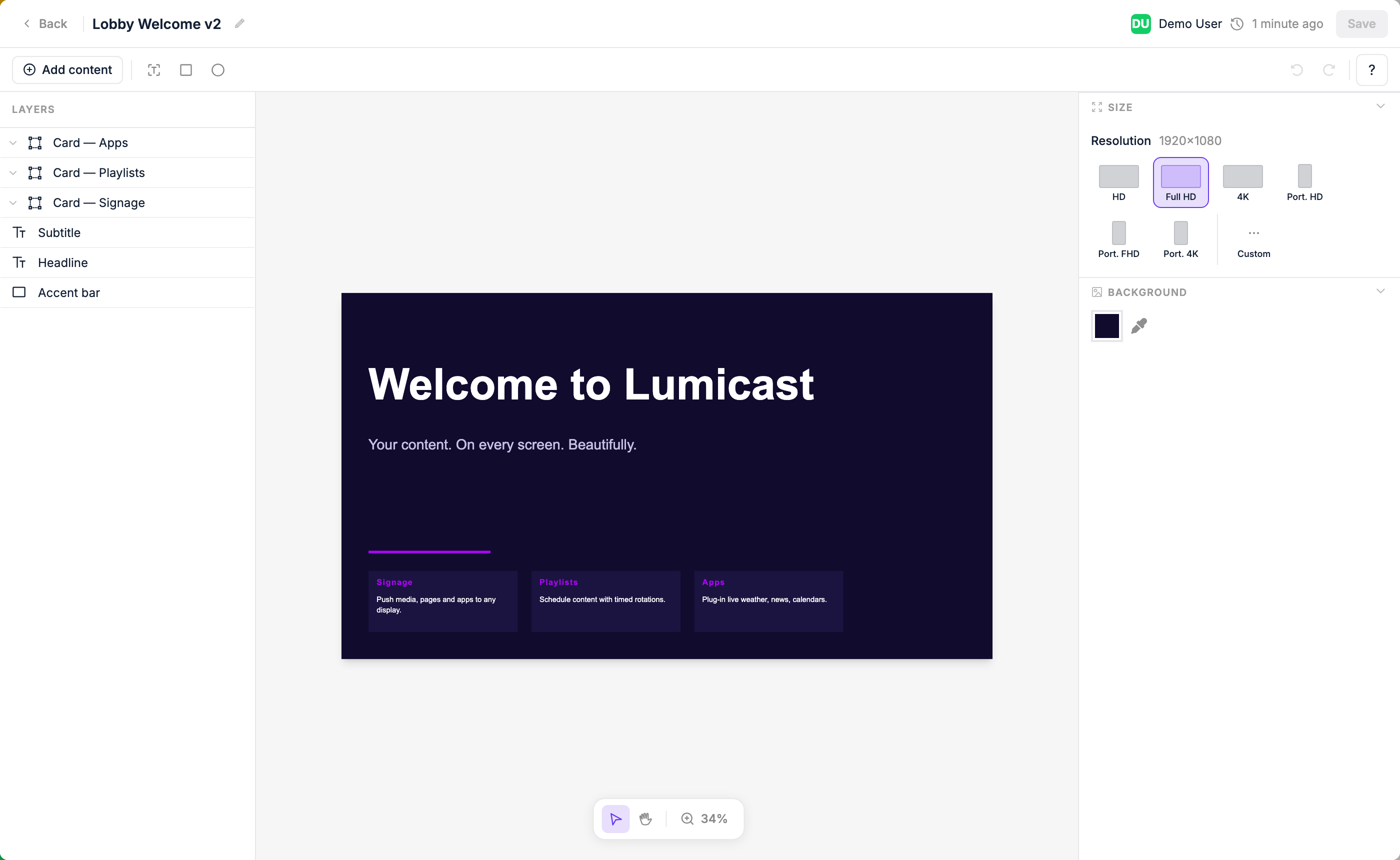
The Page Editor lets you design custom layouts for your screens — without any design software. Combine text, images, videos, shapes, and live data on a canvas that matches your screen's dimensions.
Creating a page
In the Content library, click New → Page. Give it a name and choose the dimensions (or leave them to match your display's resolution). The editor opens.
The canvas
The canvas represents your screen. What you place here is exactly what will display. Use the rulers and grid to align elements precisely.
Adding elements
Click the + button or use the toolbar to add:
| Element | What it adds |
|---|---|
| Text | A text block — resize and style it freely. Can display live data from a data source. |
| Shape | Rectangle or circle |
| Content | An image or video from your content library |
| Widget | A specialized visual component, such as a weather icon |
| Dynamic | A datasource-driven component: image, table, scrolling ticker, cycle dots, or cycle progress |
| Page | An embedded nested page |
To create a group, select multiple layers and group them — groups aren't added from the element picker. See Groups and repeating elements.
Clock and Weather
A Digital Clock and a Weather display are available as Apps that can be embedded into any page. They are not native element types.
Selecting and moving elements
Click any element to select it. Drag to move. Drag the handles to resize. Use the right-click menu to duplicate, delete, or change layering order.
Layers panel
The layers panel on the left shows all elements in the page. Click a layer to select it. Drag layers to reorder them (top of the list = front of the canvas).
Locking and hiding layers
Hover over any layer or group in the panel to reveal two icons on the right:
| Icon | What it does |
|---|---|
| Lock | Makes the layer (or group) unselectable on the canvas. Clicks pass straight through to whatever is underneath, and it's skipped when you drag to select. A locked layer is marked with a coloured lock icon and accent. Locking is saved with the page. |
| Hide (eye) | Hides the layer in the editor only. This is a temporary view aid — it does not affect what actually plays, and it resets the next time you open the page. |
Locking a group applies to the whole group, including everything inside it. To select or edit a locked layer again, click its lock icon to unlock it.
Editing under a full-screen overlay
If you place an element that covers the whole canvas — for example a seasonal decoration meant to sit on top of every page — lock it so you can still click and edit the content beneath it. If the overlay is opaque and blocks your view, hide it while you work, then show it again when you're done.
Styling
With an element selected, the right panel shows all styling controls for that element.
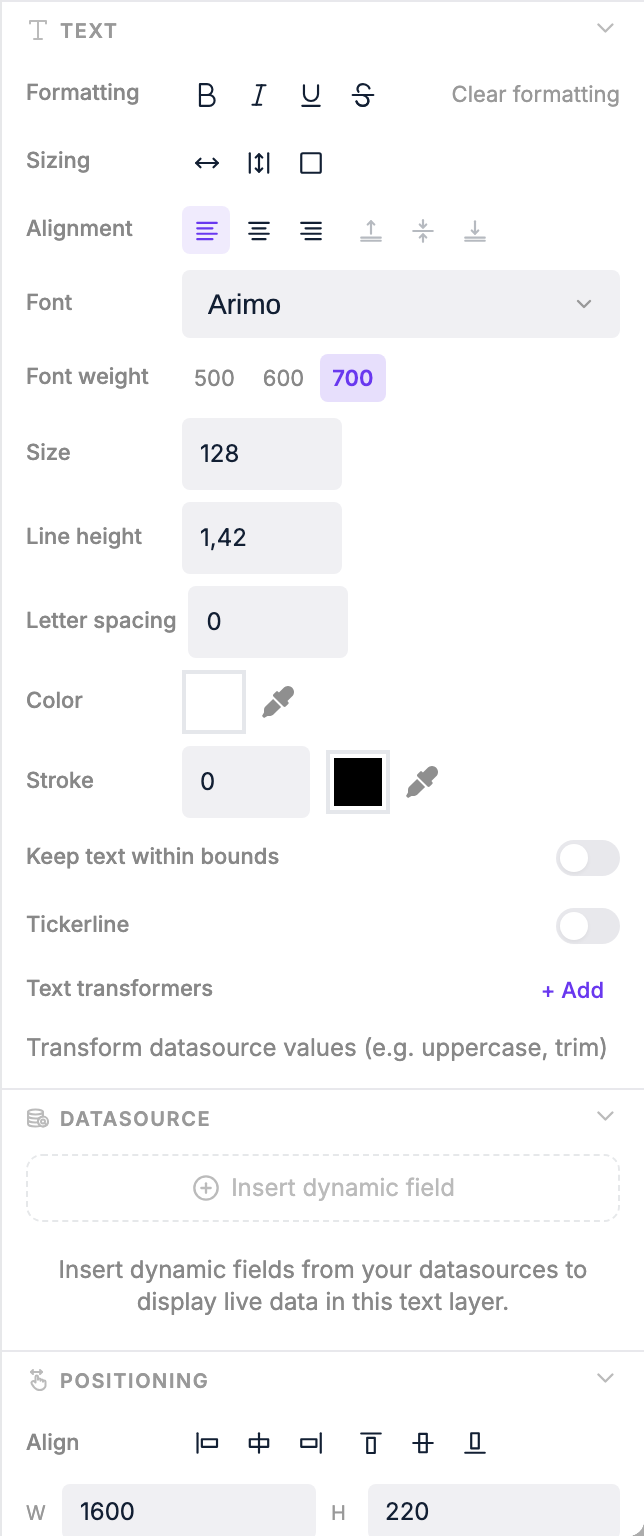
Use the right panel to change:
| Property | Options |
|---|---|
| Font (text only) | Family, size, weight, colour, alignment, vertical alignment (top / center / bottom) |
| Text sizing | Auto — element grows with content; Auto height — fixed width, height grows; Box — fixed size, text clips |
| Fill | Background colour and opacity (0–100%) |
| Border | Colour, width, and style: solid, dashed, dotted, double, groove, ridge, inset, outset |
| Border radius | Uniform or per-corner rounding (px) |
| Shadow | X offset, Y offset, blur, and colour |
| Padding | Per-side padding (px) |
| Rotation | 0–360° free rotation |
| Position & size | Exact pixel values for X, Y, width, and height |
| Scaling (content) | Scale down, contain, cover, or fill — controls how media fits the element |
Live data binding
Text elements can display live data from a Data Source, as well as time, date, weather, and context values like the display's name.
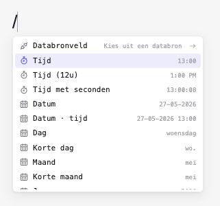
To insert a live value inside a text layer:
- Click into the text layer so the caret is where you want the value.
- Either type
/to open the slash menu, or click Add dynamic data in the right panel's Dynamic data section. - Drill in (Datasource field, Time, Weather, Context…) and pick the leaf.
The picker drops a chip at the cursor. Click any chip to open its bubble menu and change format / unit, edit the field path, or swap data source.
For a full walkthrough — mixing static text with chips, binding groups to arrays, and using cycle variables — see Binding Live Data to Pages.
Transformers
Apply transformers to format the text of a layer (including any chips inside it) before it's displayed. Open them via the Transformers section under the text element's settings in the right panel:
| Transformer | Effect |
|---|---|
| Uppercase | Converts text to ALL CAPS |
| Lowercase | Converts text to all lowercase |
| Capitalize | Capitalises the first letter of each word |
| Max length | Truncates text to a maximum number of characters |
| Replace | Replaces a substring with another value |
| Date format | Formats a date/time value using Day.js format strings (e.g. HH:mm for 24-hour time, DD MMM for day and month) |
| Round numbers | Rounds a numeric value to a chosen number of decimal places (e.g. 3.14159 → 3.14) |
You can chain multiple transformers together. They run in order, top to bottom. Date and weather temperature chips have their own format / unit controls in the chip bubble menu — you usually only need transformers for the surrounding text.
Ticker (scrolling text)
Text elements can be set to ticker mode to scroll horizontally across the screen — useful for news headlines or announcements. In the right panel, enable the ticker option and choose a scroll direction:
- Infinite — text scrolls continuously in one direction
- Bounce — text scrolls to the end then reverses
Combine ticker mode with a datasource binding to show live, scrolling content automatically.
Groups and repeating elements
A group is a set of layers you've bundled together. Select multiple layers in the canvas or layers panel and group them — the group appears as a parent in the layers panel.
Once bound to a datasource array, a group repeats over that array — all the layers inside render once per item. Use groups to display a dynamic number of rows or columns from live data, e.g. a list of upcoming train departures or calendar events.
For a full walkthrough of designing a row, grouping its layers, binding the group to an array, and pulling per-row values with the slash menu's Group field entry, see Binding Live Data to Pages.
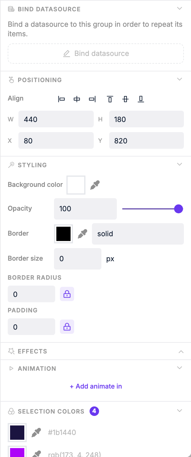
Group repeat settings:
| Setting | What it does |
|---|---|
| Direction | Lay out repeated items horizontally or vertically |
| Gap | Spacing between repeated items (px) |
| Max items | Limit how many items are shown at once |
| Skip | Skip the first N items in the datasource |
| Step | Only show every Nth item |
| Cycle interval | Automatically rotate through items over time (seconds) |
Once bound to a datasource array, each layer inside the group can reference the current item's properties.
Saving
Changes are saved automatically as you work. The page is ready to use in playlists as soon as you create it.