# Page Editor
The **Page Editor** lets you design custom layouts for your screens — without any design software. Combine text, images, videos, shapes, and live data on a canvas that matches your screen's dimensions.
## Creating a page
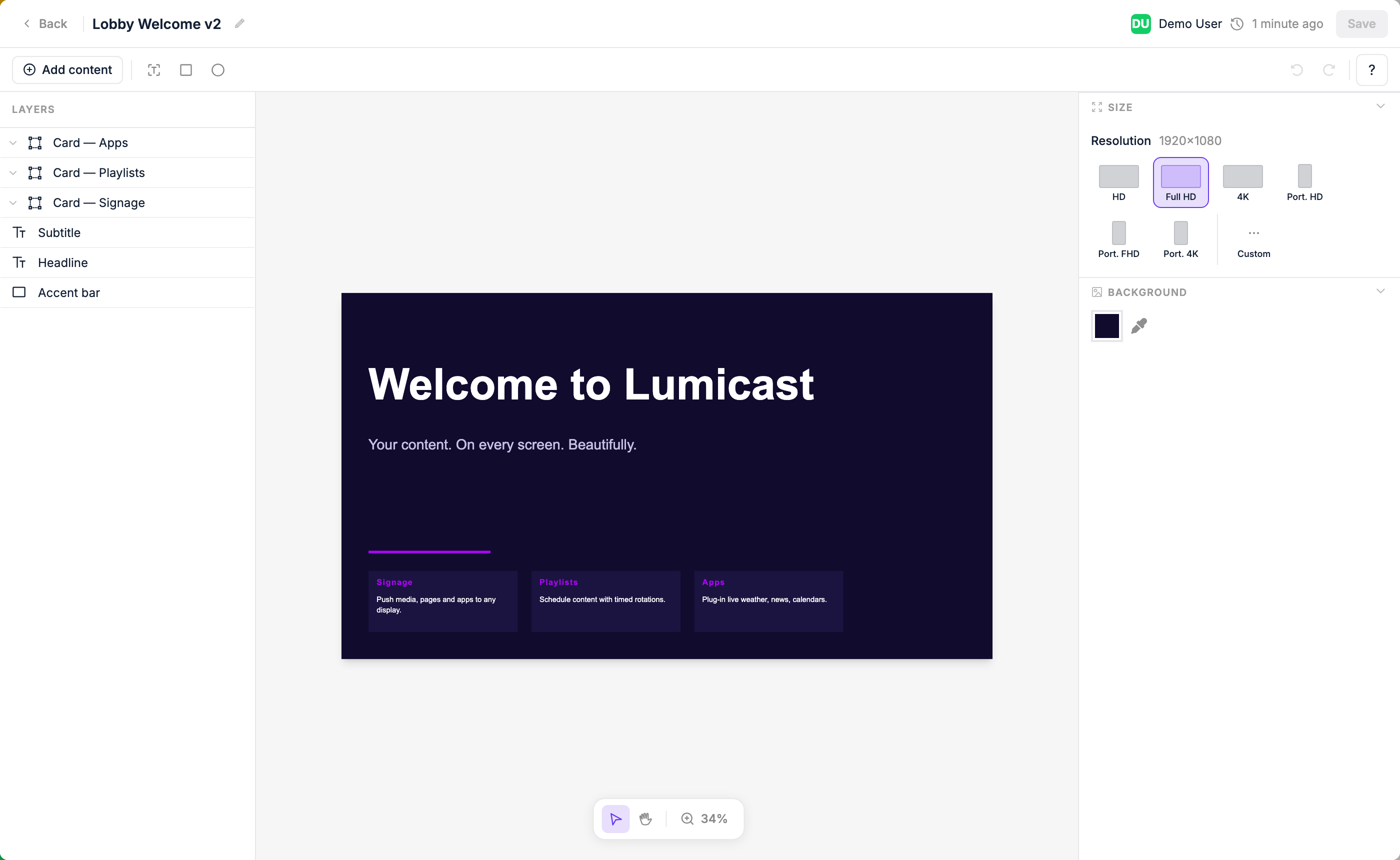
In the Content library, click **New → Page**. Give it a name and choose the dimensions (or leave them to match your display's resolution). The editor opens.
## The canvas
The canvas represents your screen. What you place here is exactly what will display. Use the rulers and grid to align elements precisely.
## Adding elements
Click the **+** button or use the toolbar to add:
| Element | What it adds |
|---|---|
| **Text** | A text block — resize and style it freely. Can display live data from a data source. |
| **Shape** | Rectangle or circle |
| **Content** | An image or video from your content library |
| **Widget** | A specialized visual component, such as a weather icon |
| **Dynamic** | A datasource-driven component: image, table, scrolling ticker, cycle dots, or cycle progress |
| **Page** | An embedded nested page |
To create a **group**, select multiple layers and group them — groups aren't added from the element picker. See [Groups and repeating elements](#groups-and-repeating-elements).
::: tip Clock and Weather
A **Digital Clock** and a **Weather** display are available as [Apps](/features/apps) that can be embedded into any page. They are not native element types.
:::
## Selecting and moving elements
Click any element to select it. Drag to move. Drag the handles to resize. Use the right-click menu to duplicate, delete, or change layering order.
## Layers panel
The layers panel on the left shows all elements in the page. Click a layer to select it. Drag layers to reorder them (top of the list = front of the canvas).
### Locking and hiding layers
Hover over any layer or group in the panel to reveal two icons on the right:
| Icon | What it does |
|---|---|
| **Lock** | Makes the layer (or group) unselectable on the canvas. Clicks pass straight through to whatever is underneath, and it's skipped when you drag to select. A locked layer is marked with a coloured lock icon and accent. **Locking is saved with the page.** |
| **Hide** (eye) | Hides the layer in the editor only. This is a temporary view aid — it does **not** affect what actually plays, and it resets the next time you open the page. |
Locking a **group** applies to the whole group, including everything inside it. To select or edit a locked layer again, click its lock icon to unlock it.
::: tip Editing under a full-screen overlay
If you place an element that covers the whole canvas — for example a seasonal decoration meant to sit on top of every page — **lock it** so you can still click and edit the content beneath it. If the overlay is opaque and blocks your view, **hide it** while you work, then show it again when you're done.
:::
## Styling
With an element selected, the right panel shows all styling controls for that element.
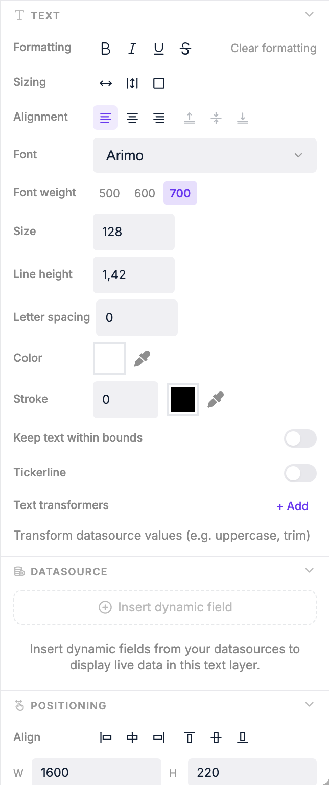 Use the right panel to change:
| Property | Options |
|---|---|
| **Font** (text only) | Family, size, weight, colour, alignment, vertical alignment (top / center / bottom) |
| **Text sizing** | **Auto** — element grows with content; **Auto height** — fixed width, height grows; **Box** — fixed size, text clips |
| **Fill** | Background colour and opacity (0–100%) |
| **Border** | Colour, width, and style: solid, dashed, dotted, double, groove, ridge, inset, outset |
| **Border radius** | Uniform or per-corner rounding (px) |
| **Shadow** | X offset, Y offset, blur, and colour |
| **Padding** | Per-side padding (px) |
| **Rotation** | 0–360° free rotation |
| **Position & size** | Exact pixel values for X, Y, width, and height |
| **Scaling** (content) | Scale down, contain, cover, or fill — controls how media fits the element |
## Live data binding
Text elements can display live data from a [Data Source](/features/datasources), as well as time, date, weather, and context values like the display's name.
To insert a live value inside a text layer:
1. Click into the text layer so the caret is where you want the value.
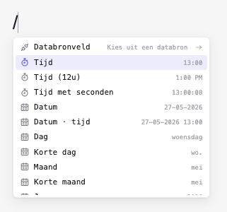
2. Either **type `/`** to open the slash menu, or click **Add dynamic data** in the right panel's *Dynamic data* section.
3. Drill in (Datasource field, Time, Weather, Context…) and pick the leaf.
The picker drops a **chip** at the cursor. Click any chip to open its bubble menu and change format / unit, edit the field path, or swap data source.
For a full walkthrough — mixing static text with chips, binding groups to arrays, and using cycle variables — see [Binding Live Data to Pages](/features/binding-data).
Use the right panel to change:
| Property | Options |
|---|---|
| **Font** (text only) | Family, size, weight, colour, alignment, vertical alignment (top / center / bottom) |
| **Text sizing** | **Auto** — element grows with content; **Auto height** — fixed width, height grows; **Box** — fixed size, text clips |
| **Fill** | Background colour and opacity (0–100%) |
| **Border** | Colour, width, and style: solid, dashed, dotted, double, groove, ridge, inset, outset |
| **Border radius** | Uniform or per-corner rounding (px) |
| **Shadow** | X offset, Y offset, blur, and colour |
| **Padding** | Per-side padding (px) |
| **Rotation** | 0–360° free rotation |
| **Position & size** | Exact pixel values for X, Y, width, and height |
| **Scaling** (content) | Scale down, contain, cover, or fill — controls how media fits the element |
## Live data binding
Text elements can display live data from a [Data Source](/features/datasources), as well as time, date, weather, and context values like the display's name.
To insert a live value inside a text layer:
1. Click into the text layer so the caret is where you want the value.
2. Either **type `/`** to open the slash menu, or click **Add dynamic data** in the right panel's *Dynamic data* section.
3. Drill in (Datasource field, Time, Weather, Context…) and pick the leaf.
The picker drops a **chip** at the cursor. Click any chip to open its bubble menu and change format / unit, edit the field path, or swap data source.
For a full walkthrough — mixing static text with chips, binding groups to arrays, and using cycle variables — see [Binding Live Data to Pages](/features/binding-data).
 ### Transformers
Apply **transformers** to format the text of a layer (including any chips inside it) before it's displayed. Open them via the *Transformers* section under the text element's settings in the right panel:
| Transformer | Effect |
|---|---|
| **Uppercase** | Converts text to ALL CAPS |
| **Lowercase** | Converts text to all lowercase |
| **Capitalize** | Capitalises the first letter of each word |
| **Max length** | Truncates text to a maximum number of characters |
| **Replace** | Replaces a substring with another value |
| **Date format** | Formats a date/time value using [Day.js format strings](https://day.js.org/docs/en/display/format) (e.g. `HH:mm` for 24-hour time, `DD MMM` for day and month) |
| **Round numbers** | Rounds a numeric value to a chosen number of decimal places (e.g. `3.14159` → `3.14`) |
You can chain multiple transformers together. They run in order, top to bottom. Date and weather temperature chips have their own format / unit controls in the chip bubble menu — you usually only need transformers for the surrounding text.
## Ticker (scrolling text)
Text elements can be set to **ticker mode** to scroll horizontally across the screen — useful for news headlines or announcements. In the right panel, enable the ticker option and choose a scroll direction:
- **Infinite** — text scrolls continuously in one direction
- **Bounce** — text scrolls to the end then reverses
Combine ticker mode with a datasource binding to show live, scrolling content automatically.
## Groups and repeating elements
A **group** is a set of layers you've bundled together. Select multiple layers in the canvas or layers panel and group them — the group appears as a parent in the layers panel.
Once bound to a datasource array, a group repeats over that array — all the layers inside render once per item. Use groups to display a dynamic number of rows or columns from live data, e.g. a list of upcoming train departures or calendar events.
For a full walkthrough of designing a row, grouping its layers, binding the group to an array, and pulling per-row values with the slash menu's **Group field** entry, see [Binding Live Data to Pages](/features/binding-data#binding-a-group-to-a-list).
### Transformers
Apply **transformers** to format the text of a layer (including any chips inside it) before it's displayed. Open them via the *Transformers* section under the text element's settings in the right panel:
| Transformer | Effect |
|---|---|
| **Uppercase** | Converts text to ALL CAPS |
| **Lowercase** | Converts text to all lowercase |
| **Capitalize** | Capitalises the first letter of each word |
| **Max length** | Truncates text to a maximum number of characters |
| **Replace** | Replaces a substring with another value |
| **Date format** | Formats a date/time value using [Day.js format strings](https://day.js.org/docs/en/display/format) (e.g. `HH:mm` for 24-hour time, `DD MMM` for day and month) |
| **Round numbers** | Rounds a numeric value to a chosen number of decimal places (e.g. `3.14159` → `3.14`) |
You can chain multiple transformers together. They run in order, top to bottom. Date and weather temperature chips have their own format / unit controls in the chip bubble menu — you usually only need transformers for the surrounding text.
## Ticker (scrolling text)
Text elements can be set to **ticker mode** to scroll horizontally across the screen — useful for news headlines or announcements. In the right panel, enable the ticker option and choose a scroll direction:
- **Infinite** — text scrolls continuously in one direction
- **Bounce** — text scrolls to the end then reverses
Combine ticker mode with a datasource binding to show live, scrolling content automatically.
## Groups and repeating elements
A **group** is a set of layers you've bundled together. Select multiple layers in the canvas or layers panel and group them — the group appears as a parent in the layers panel.
Once bound to a datasource array, a group repeats over that array — all the layers inside render once per item. Use groups to display a dynamic number of rows or columns from live data, e.g. a list of upcoming train departures or calendar events.
For a full walkthrough of designing a row, grouping its layers, binding the group to an array, and pulling per-row values with the slash menu's **Group field** entry, see [Binding Live Data to Pages](/features/binding-data#binding-a-group-to-a-list).
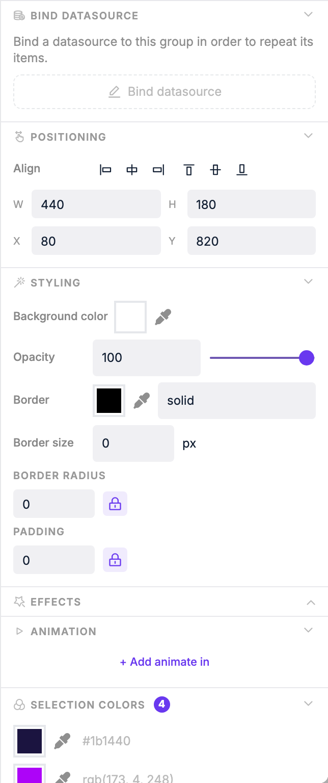 Group repeat settings:
| Setting | What it does |
|---|---|
| **Direction** | Lay out repeated items horizontally or vertically |
| **Gap** | Spacing between repeated items (px) |
| **Max items** | Limit how many items are shown at once |
| **Skip** | Skip the first N items in the datasource |
| **Step** | Only show every Nth item |
| **Cycle interval** | Automatically rotate through items over time (seconds) |
Once bound to a datasource array, each layer inside the group can reference the current item's properties.
## Saving
Changes are saved automatically as you work. The page is ready to use in playlists as soon as you create it.
Group repeat settings:
| Setting | What it does |
|---|---|
| **Direction** | Lay out repeated items horizontally or vertically |
| **Gap** | Spacing between repeated items (px) |
| **Max items** | Limit how many items are shown at once |
| **Skip** | Skip the first N items in the datasource |
| **Step** | Only show every Nth item |
| **Cycle interval** | Automatically rotate through items over time (seconds) |
Once bound to a datasource array, each layer inside the group can reference the current item's properties.
## Saving
Changes are saved automatically as you work. The page is ready to use in playlists as soon as you create it.